Running the Dashboard
The fSTG Toolkit dashboard provides an interactive web interface for exploring spatio-temporal graphs, metrics, raw correlation matrices, and frequent patterns.
Prerequisites
Install the [dashboard] extra:
pip install "fSTG-Toolkit[dashboard]"
One-Shot Mode: Exploring a Single Dataset
The show command starts a local server and opens your default browser automatically:
python -m fstg_toolkit dashboard show my_graphs.zip
The dashboard will be available at http://127.0.0.1:8050/dashboard/<token>.
Options
Flag |
Default |
Description |
|---|---|---|
|
|
Port to listen on |
|
off |
Start the server without opening a browser tab |
|
off |
Enable Dash debug mode with hot-reload |
python -m fstg_toolkit dashboard show --port 8080 --no-browser my_graphs.zip
Persistent Mode: Multi-Dataset Server
Use the serve command to run a persistent server that supports multiple datasets and file
uploads:
python -m fstg_toolkit dashboard serve /path/to/data /path/to/uploads
Both paths must be existing, writable directories.
Options
Flag |
Default |
Description |
|---|---|---|
|
|
Port to listen on |
|
|
SQLite database for tracking uploaded datasets |
|
|
Token length for dataset URLs (increase for many simultaneous users) |
|
off |
Enable Dash debug mode |
Home Page
The home page gives a step-by-step overview of the workflow: submit a dataset, monitor processing, and then explore the dashboard once processing is complete.
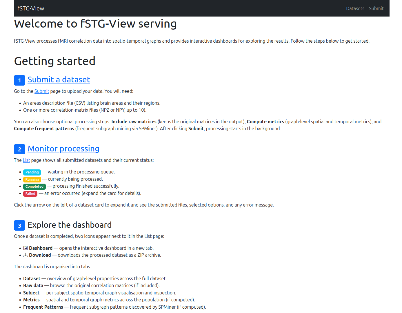
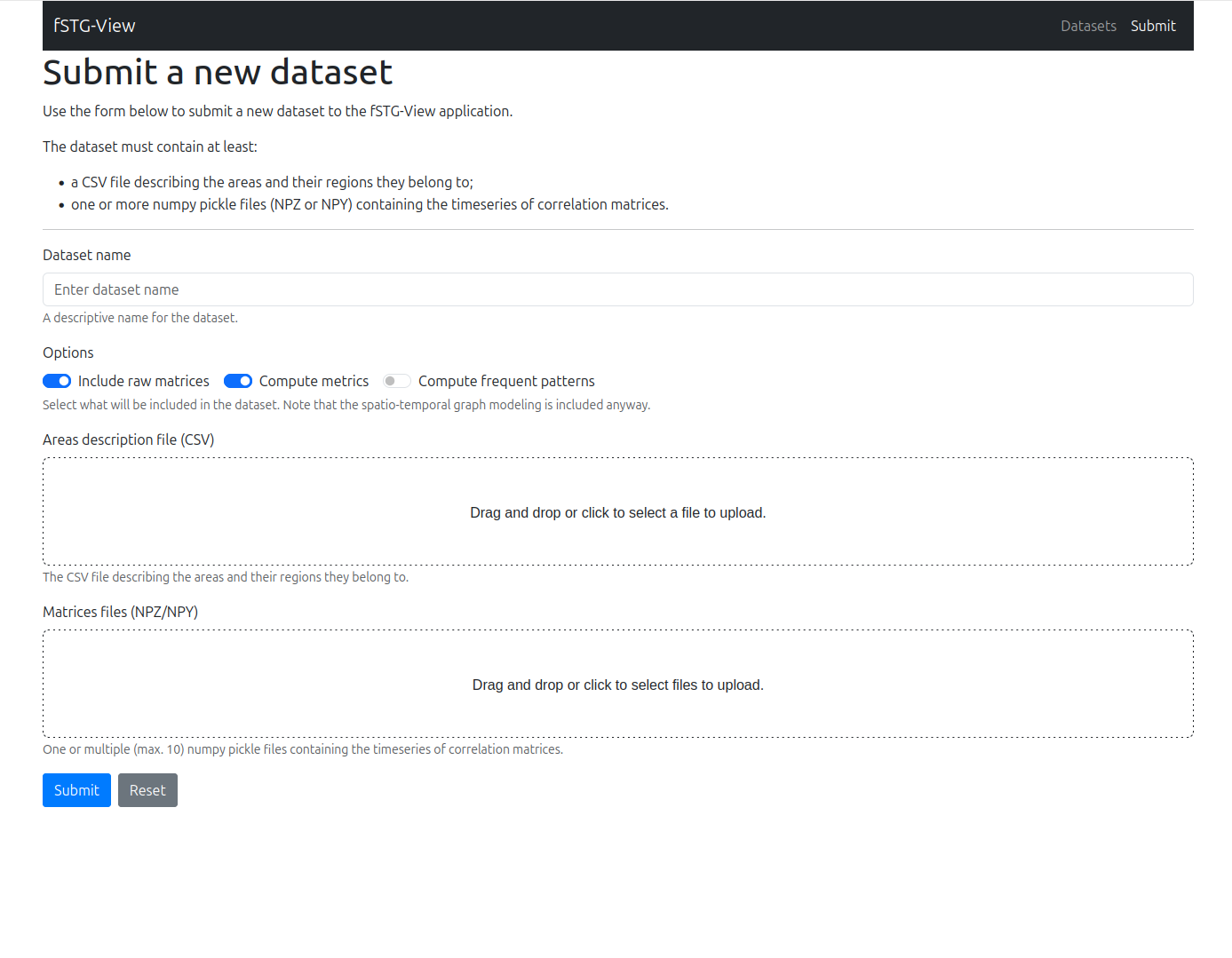
Submitting a Dataset
The Submit page (persistent mode only) lets you upload a new dataset to the server. Provide a name, select your areas CSV file and one or more matrix files (NPZ or NPY), and choose which optional processing steps to run:
Include raw matrices — keep the original matrices in the output archive.
Compute metrics — calculate spatial and temporal graph metrics.
Compute frequent patterns — run frequent subgraph mining via SPMiner (requires Docker).
After clicking Submit, processing starts in the background and the dataset appears in the list with a Pending status.
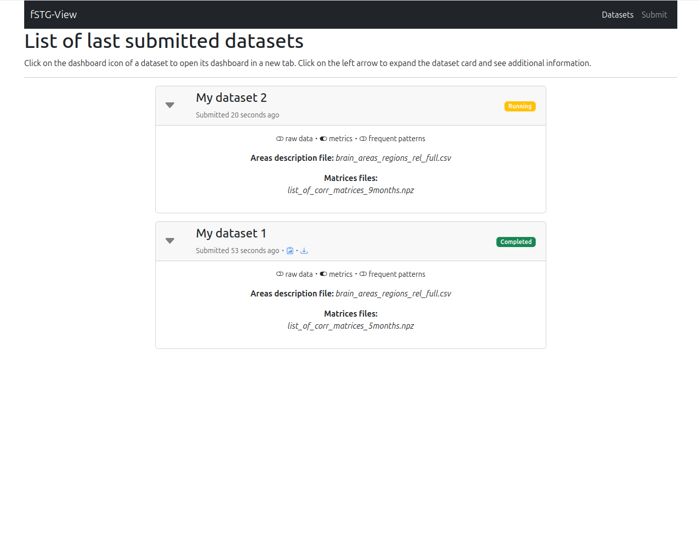
Dataset List
The Datasets page lists all submitted datasets and their current processing status. Each card can be expanded to show the submitted files and any error messages.
Datasets go through four states:
Badge |
Meaning |
|---|---|
Pending |
Waiting in the processing queue |
Processing |
Currently being processed |
Completed |
Processing finished successfully |
Failed |
An error occurred — expand the card for details |
Click the Dashboard icon next to a completed dataset to open it in a new tab, or the Download icon to retrieve the processed ZIP archive.
Dashboard Pages
Once a dataset is opened, the dashboard provides five tabs for interactive exploration.
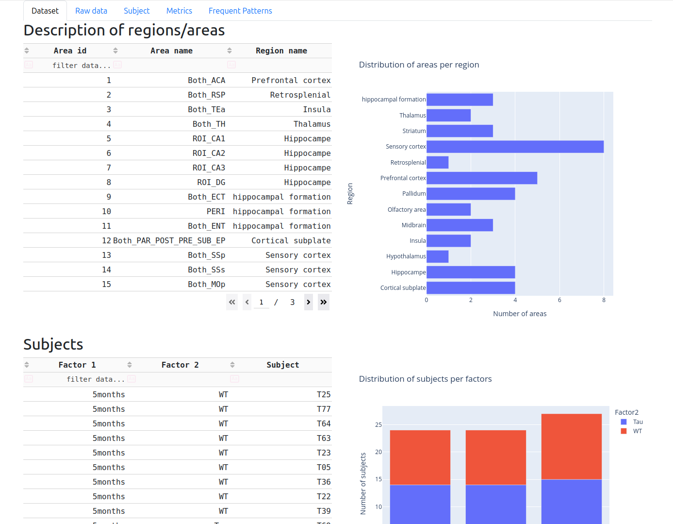
Dataset Tab
The Dataset tab gives a global overview of the loaded data: the list of brain regions/areas with their identifiers and region names, a bar chart of how many areas belong to each region, and a table of all detected subjects with their factor breakdown and a stacked bar chart of their distribution.
Use this tab to verify that the toolkit parsed your areas CSV and matrix filenames correctly before exploring further.
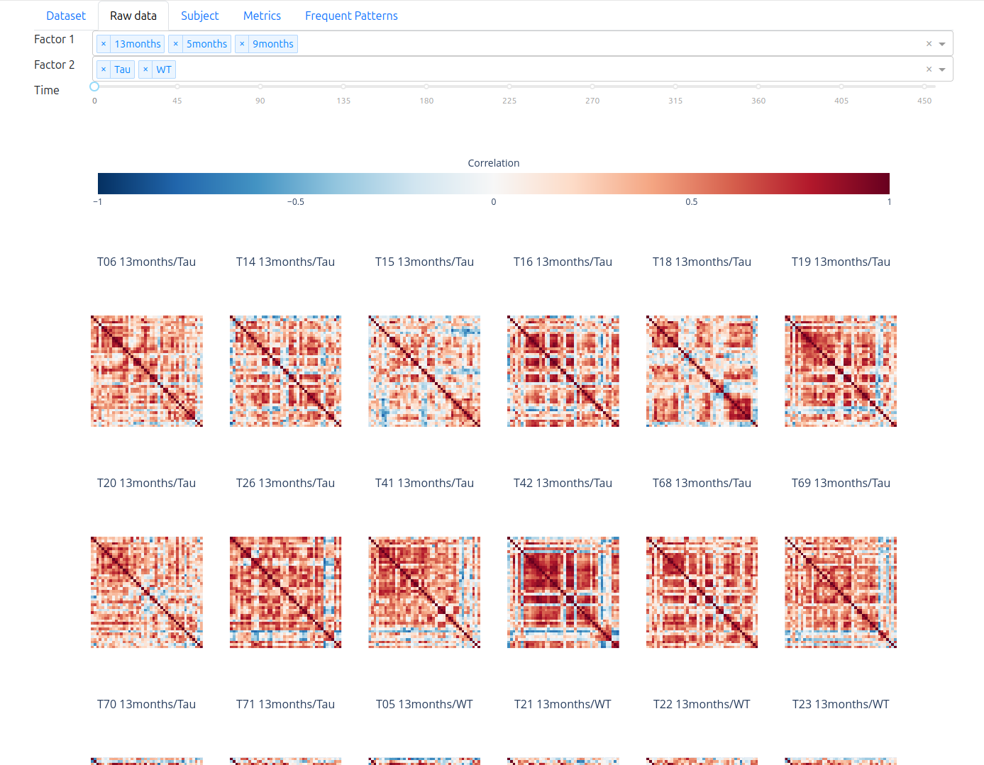
Raw Data Tab
The Raw data tab shows heatmap visualisations of the original correlation matrices before graph construction. Use the Factor 1, Factor 2, and Time dropdowns at the top to filter which matrices are displayed. This is useful for a sanity check of the raw correlations and for spotting noisy or outlier subjects.
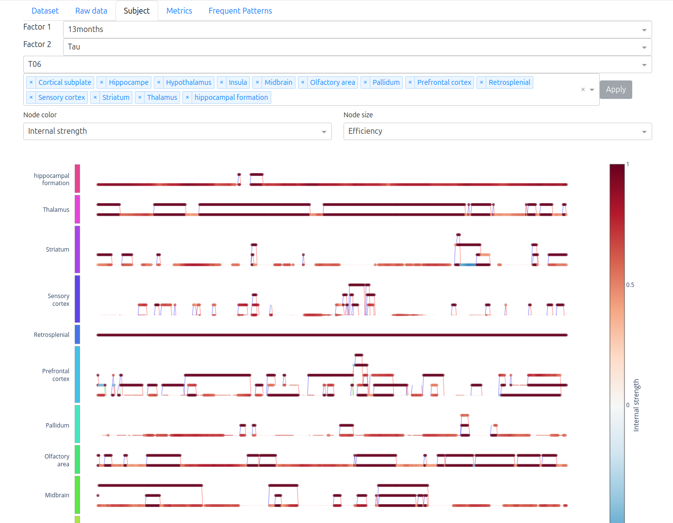
Subject Tab
The Subject tab displays the spatio-temporal graph for a single subject as an interactive multipartite plot — areas on the vertical axis, time steps on the horizontal axis. Spatial edges (functional connectivity) appear as horizontal links; temporal edges (RC5 relations) connect the same area across consecutive time steps.
Use the Factor 1, Factor 2, and Title dropdowns to select the subject, then choose the Node color and Node size metrics from the dropdowns below the graph to highlight specific graph properties. Hover over nodes and edges for detailed values.
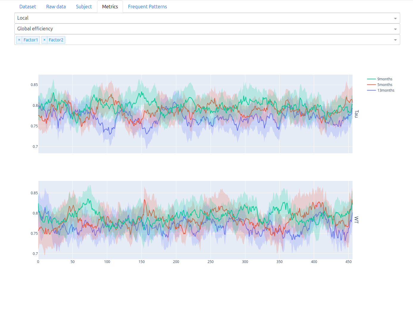
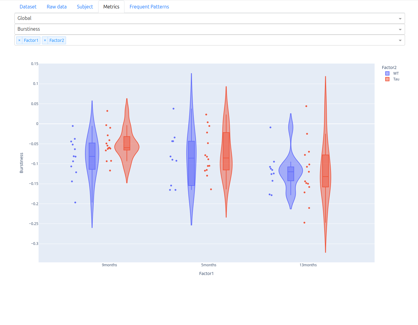
Metrics Tab
The Metrics tab provides interactive charts of the computed graph metrics.
Switch between Local and Global in the first dropdown:
Local — per-node spatial metrics (e.g., efficiency, clustering) plotted as time series across subjects. Select a metric and use the factor dropdowns to compare groups. Each factor level is shown as a coloured band (mean ± standard deviation).
Global — per-graph temporal metrics (e.g., burstiness) shown as violin plots across factor levels, making group differences immediately visible.
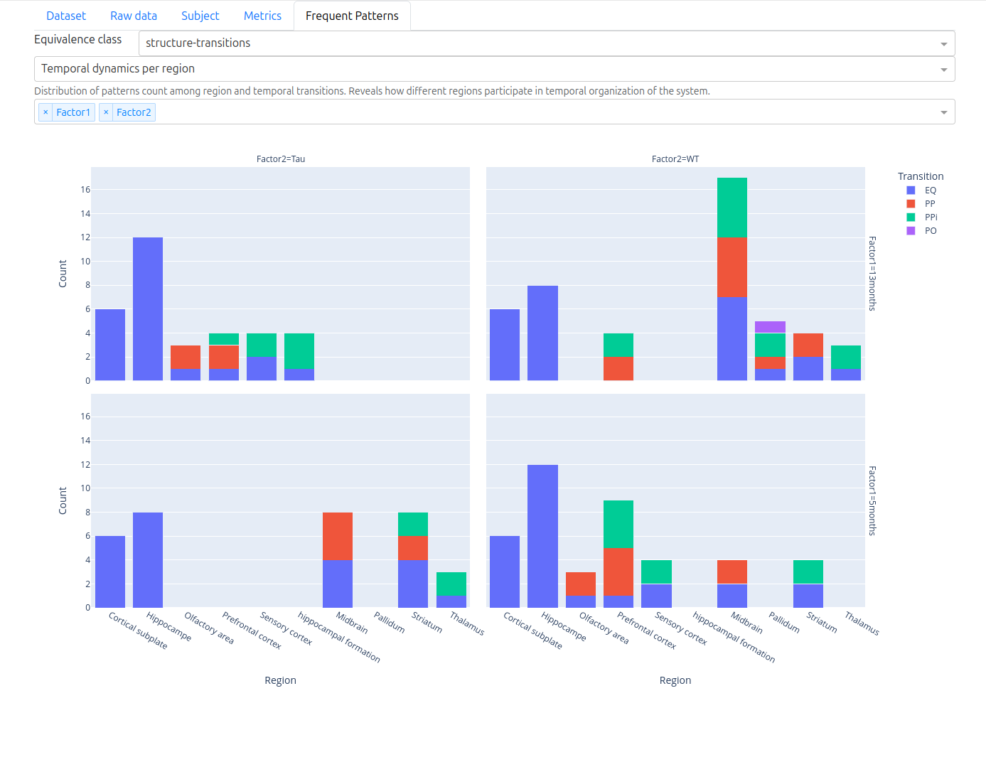
Frequent Patterns Tab
The Frequent Patterns tab is available after running frequent subgraph pattern mining. It shows how discovered patterns distribute across brain regions and RC5 temporal transitions, broken down by factor level. Use the Equivalence class and Temporal dynamics dropdowns to navigate between pattern families.
Factor and Subject Filtering
If your matrix names follow the factor_factor_subject naming convention, the dashboard
automatically detects factors and presents them as filter dropdowns throughout all tabs.
See Usage: Factor and Subject Detection for details.
Next Steps
Frequent Pattern Mining — discover recurring connectivity patterns
API Reference: app — dashboard internals